
Lemonyay!
Bright, Fun, and Delicious
When Amanda reached out about a website for her catering business, she already had a logo, a lemon slice, and a color palette she loved — all the work of another designer. What she needed was everything else.
This is the branding Amanda had when she initially contacted me…
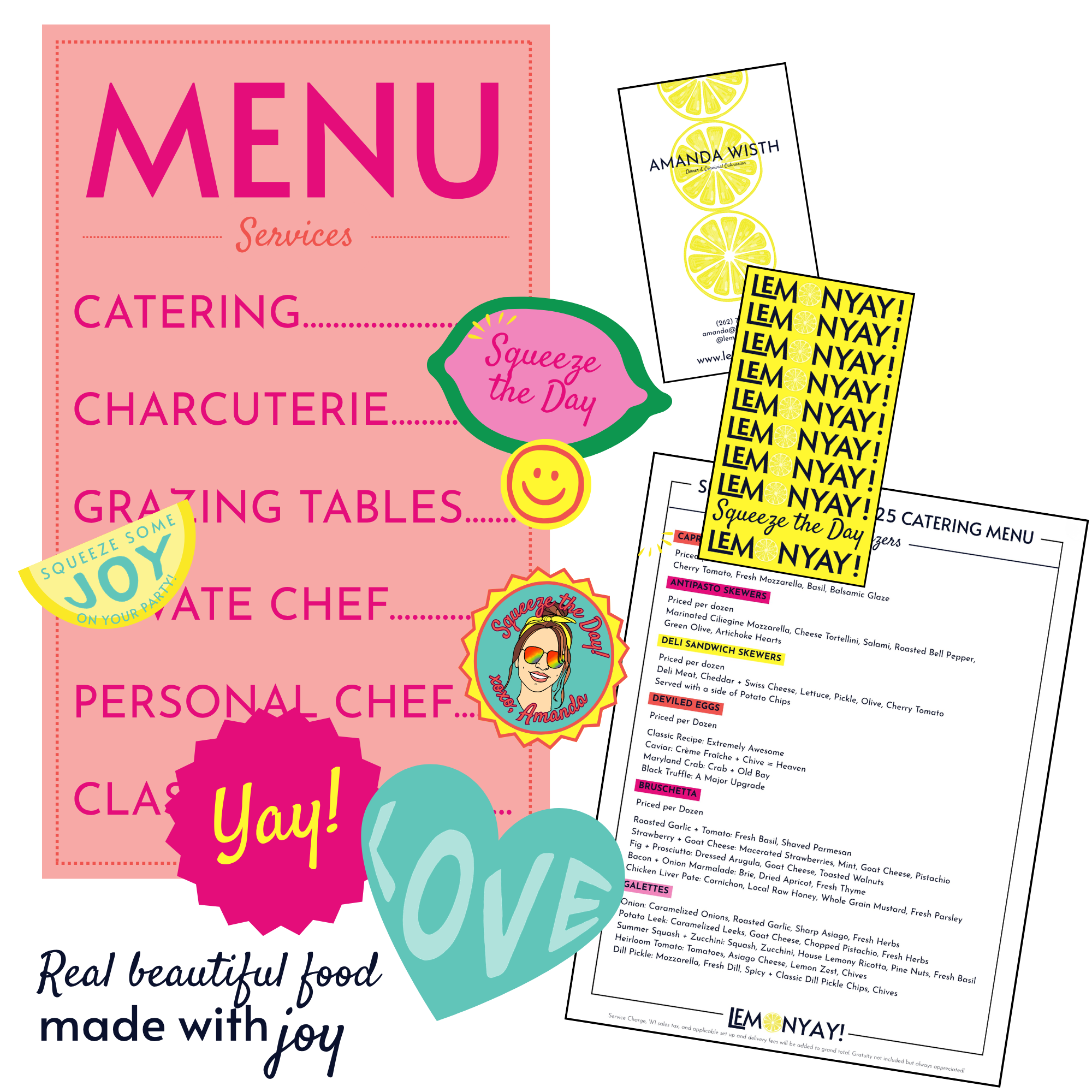
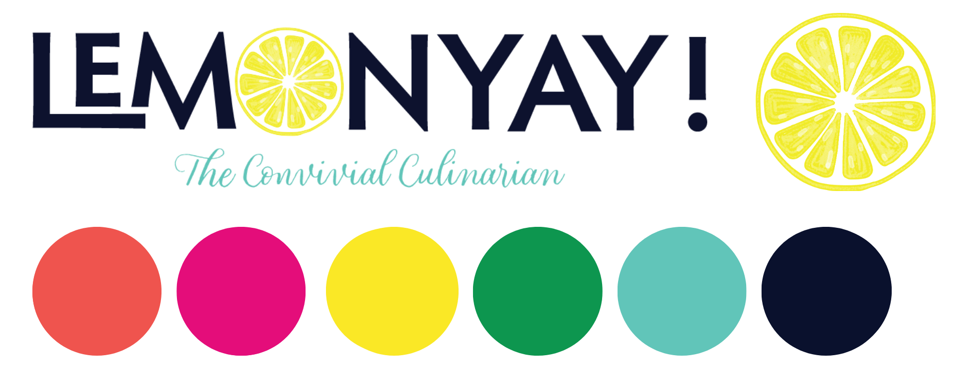
…and this is a sample of her expanded visual brand identity, and a few of her brand assets after working with me.
Lemonyay! is a great example of what it looks like to take a logo and build a full brand around it. We started with brand voice — joyful, fun, warm, and inviting — and let that drive everything that came after. I expanded her visual identity into a complete brand suite, created all the illustrations and graphics for her website, and designed her business cards and email signature. For Lemonyay!, bespoke also meant printable catering menus — bright, colorful, and exactly as fun as her clients expect.
KindHeart Massage
Calm, Grounded, Beautiful, Real
Jenny knew she wanted to open a massage therapy studio rooted in mindfulness and well-being. What she didn't have yet was a name or the words to describe her approach to massage. That's the fun part — that's where we dig in.
After a lot of conversations, some branding exercises, and many sketches of hands, we landed on KindHeart Massage. The soothing color palette, simple line drawings of aromatherapy plants, and the KindHeart logo all say exactly what Jenny needs them to say — calm, grounded, beautiful, and real. Just like her.
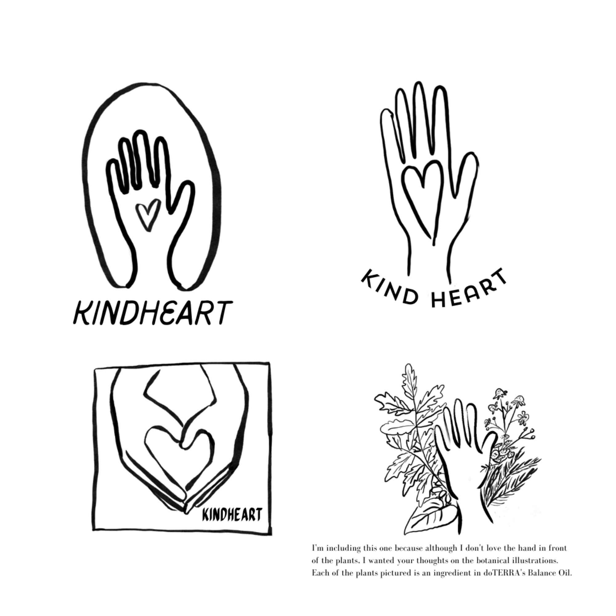
The initial logo concepts for KindHeart were all circling the same idea, hands, but they weren’t quite right. In trying to describe the way she wanted the hand to look, Jenny held up her own hand, and we realized we should just use hers, so we did!
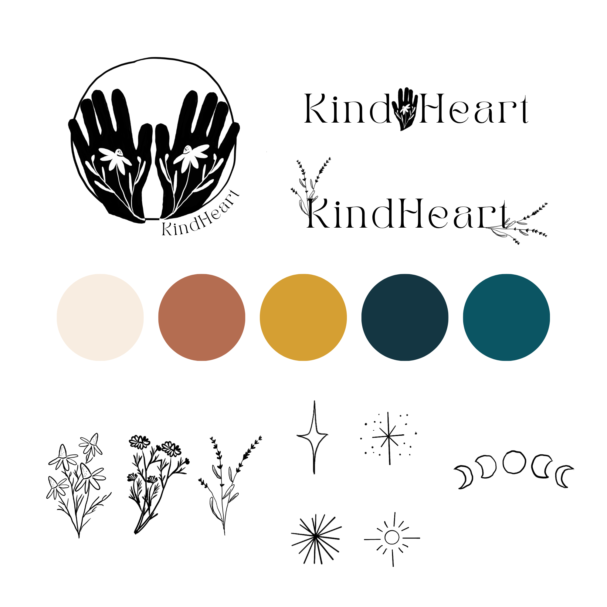
With Jenny’s hand as the logo, everything else fell into place.
Fides Law
Polished, Professional, Credible
Two trust and estate lawyers left a big corporate firm to build something of their own. They came in with a name — Fides, the Roman goddess of trust, honesty, and good faith — and a clear vision for their firm. When clients know their industry that well, things move fast.
The Fides logo is packed with symbolism: the goddess herself, her dog (the origin of the name Fido), and a bouquet of pomegranates, wheat, and iris — a nod to ancient representations of Fides with trust woven in. She represents the firm and the safeguarding of their clients' legacies. For documents where that level of detail doesn't translate, the laurel wordmark steps in — classic, clean, and completely at home within the same brand world.
As a trust and estates law firm, they have to earn clients' trust before anyone walks through the door. The website needed to carry the weight of that responsibility — polished, professional, and credible, without losing the distinctive look and feel that makes this firm unlike any other.
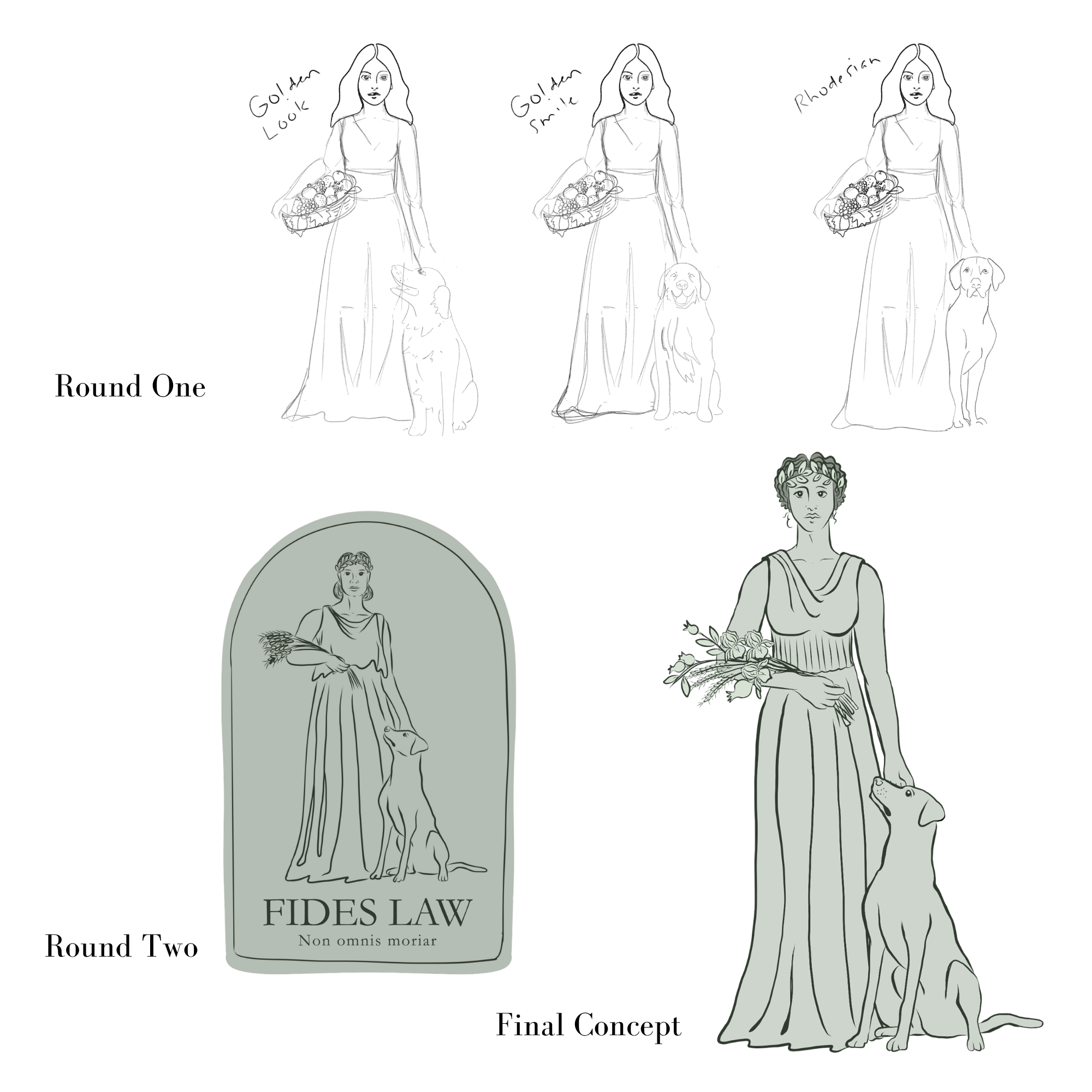
The greatest challenge in depicting Fides was capturing her age. She needed to embody mature dignity — experienced, serene, and authoritative.
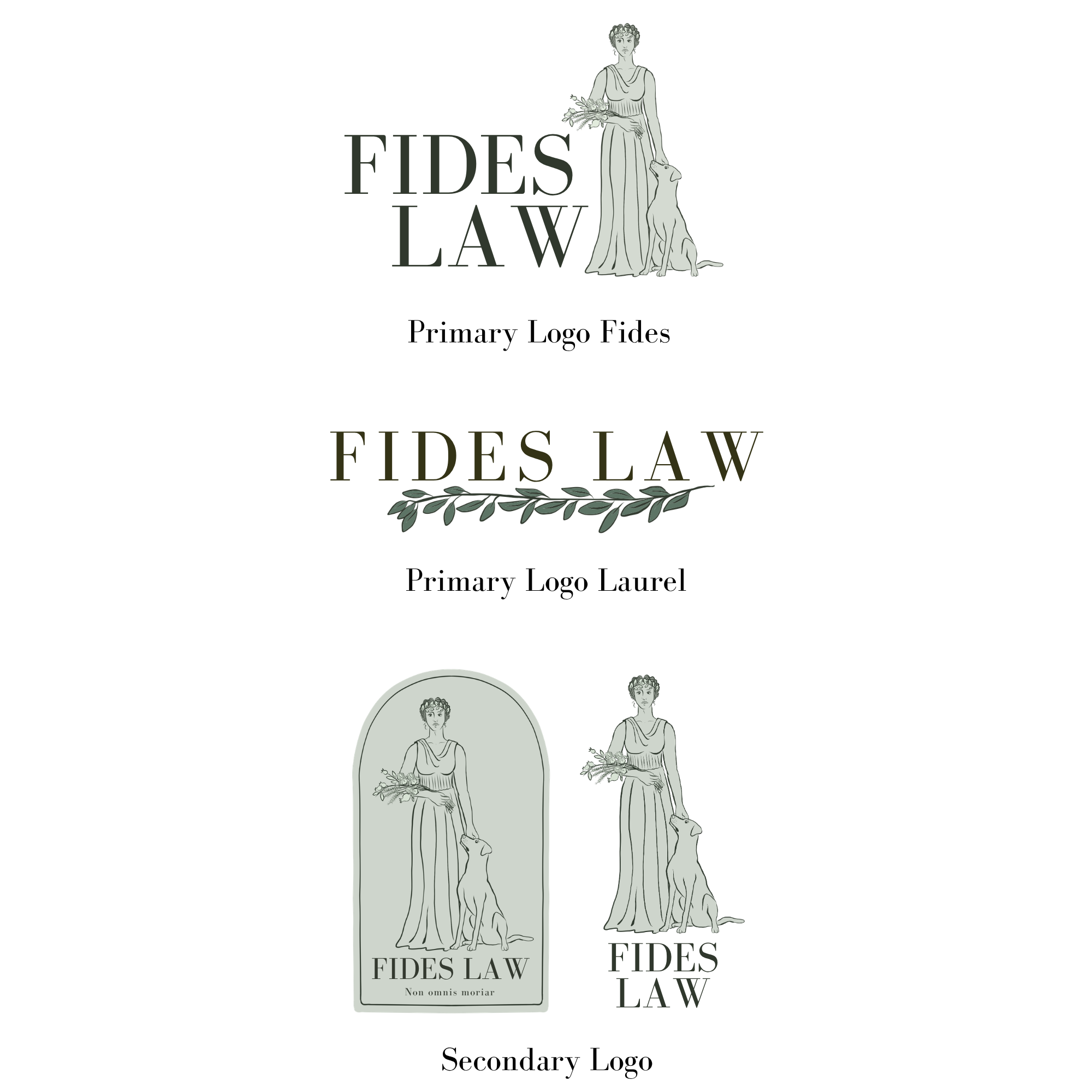
Rather than forcing a single logo to work across every context, we developed a simple, classic laurel design that complements the broader Fides visual identity, a streamlined alternative that preserves the beauty of the Fides brand for situations that call for something less complex.
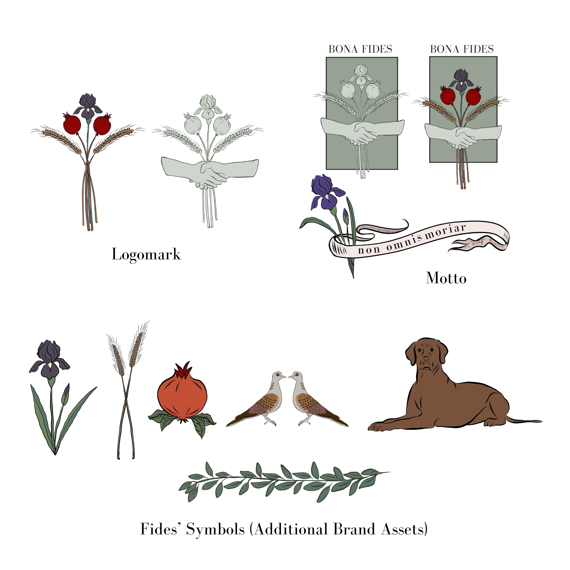
Given the depth of history and symbolism behind the firm's name, it was a pleasure to develop a rich library of visual assets for Fides Law — imagery they could draw from across their website, as well as everything from stationery and document templates to labels and signage.
Pink Apron Provisions
"I'm toying with getting back into the catering business, and I'm testing the waters with private chef dinners. Guests keep asking me for business cards, and I don't have one. I tried making a logo with AI, but it's all wrong."
AI image generation is impressive. It's just not the same as sitting across from a real person who asks real questions — who finds out you used to live in Australia, asks if you have a favorite apron, and listens closely enough to learn that the one with the birds on it is special. It reminds you of going on walks with your eldest son when he was a baby, and how you made a habit of stopping to look at a tree that was always full of galah birds.
That's the logo.
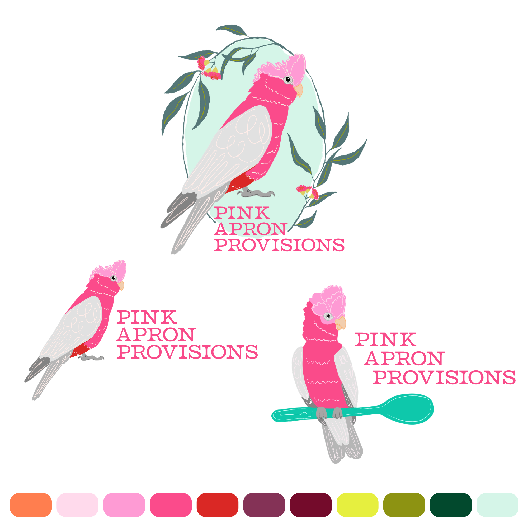
Pink Apron Provisions is a brand in its early stages, and I'm looking forward to growing alongside them as their business takes shape — there's a lot more pink galah bird to come!
Row, Row, Row, Your Boat Club
“We want to throw a rowing-themed baby shower for our coach, and we’ve looked all over Pinterest and Etsy for ideas, but that doesn’t seem to be a thing. Can you help? She’s not finding out if she’s having a boy or a girl, so it needs to be gender-neutral, and she’s decorating the baby’s nursery in a woodland theme.”
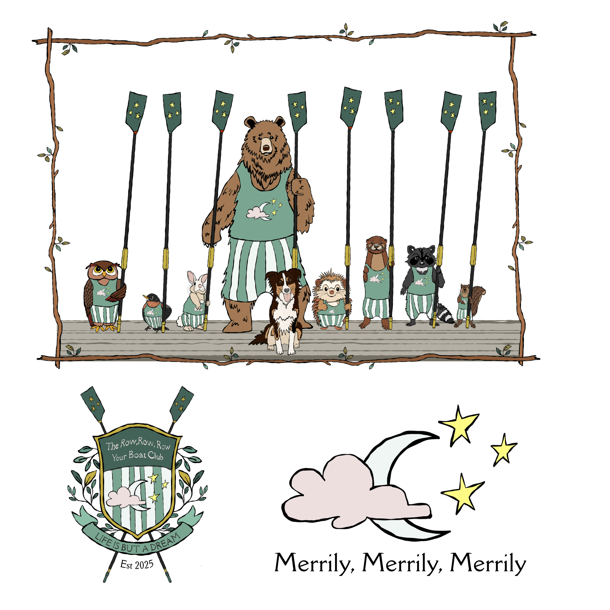
The team photo was based on the University of Washington crew from the book The Boys in the Boat.